
Two debit cards, six ways to land.
nbkc bank in Kansas City was issuing new vertical Mastercard debit cards for personal and business accounts. Working through the agency Native Digital, I built both cards in 3D from the printer's files and staged them in six animated scenes, each rendered in both colourways.
Show the card before it is in anyone's hand.
A new card launches before customers have one, so the bank needed it on screen and in print first. The brief set six scenes for two cards, with each card's finishes rendered as they print: a clear gloss wordmark, a metallic chip and a holographic foil on the back.
- Client
- nbkc bank, an online bank in Kansas City
- Agency
- Native Digital, Kansas City, which brought me in for the 3D
- Card design
- nbkc's own, supplied as the printer's production files
- Made
- 12 animations, 12 loops and 12 stills at 1440×1080, then 14 print stills at 6000×4500
- Feb 7First proposal
- Apr 1Scope set: six scenes, two cards
- Apr 12Print files in, card built
- Apr 22Style frames
- Apr 30Full package delivered
- Aug 16Print stills at 6000 px
Six scenes, each its own idea.
Every scene gives the card one job: catch the light, turn over, step out of a crowd, top a stack, sit on top of a pile, lead a deck. The grounds stay pale, sky blue and cream, so the card is always the strongest colour on screen. Each tile shows the other card from the cut above; select one to watch the full delivered film on either card.
Built once, rendered twice.
Each scene was set up once and rendered for both cards, so the bank could put either one anywhere. The move, light and timing match frame for frame; only the card changes.
The finishes have to move.
A gloss wordmark is invisible until light crosses it, and a chip only reads as metal when it turns. So the scenes were lit to show each finish the brief named, in motion: the varnish, the chip, the foil and stripe on the back, the card edges.
In August the scenes were rendered again as stills at 6000×4500 for print, fourteen frames across both cards, most with transparent grounds so a layout can set the cards on its own colour, as this page does below.

Built from the print file.
The cards arrived as the printer's proofs. On them the nbkc wordmark is orange, the colour the proof uses to mark the gloss layer. On the real card it is clear varnish over the card colour, which is why the 3D card shows it tone on tone.
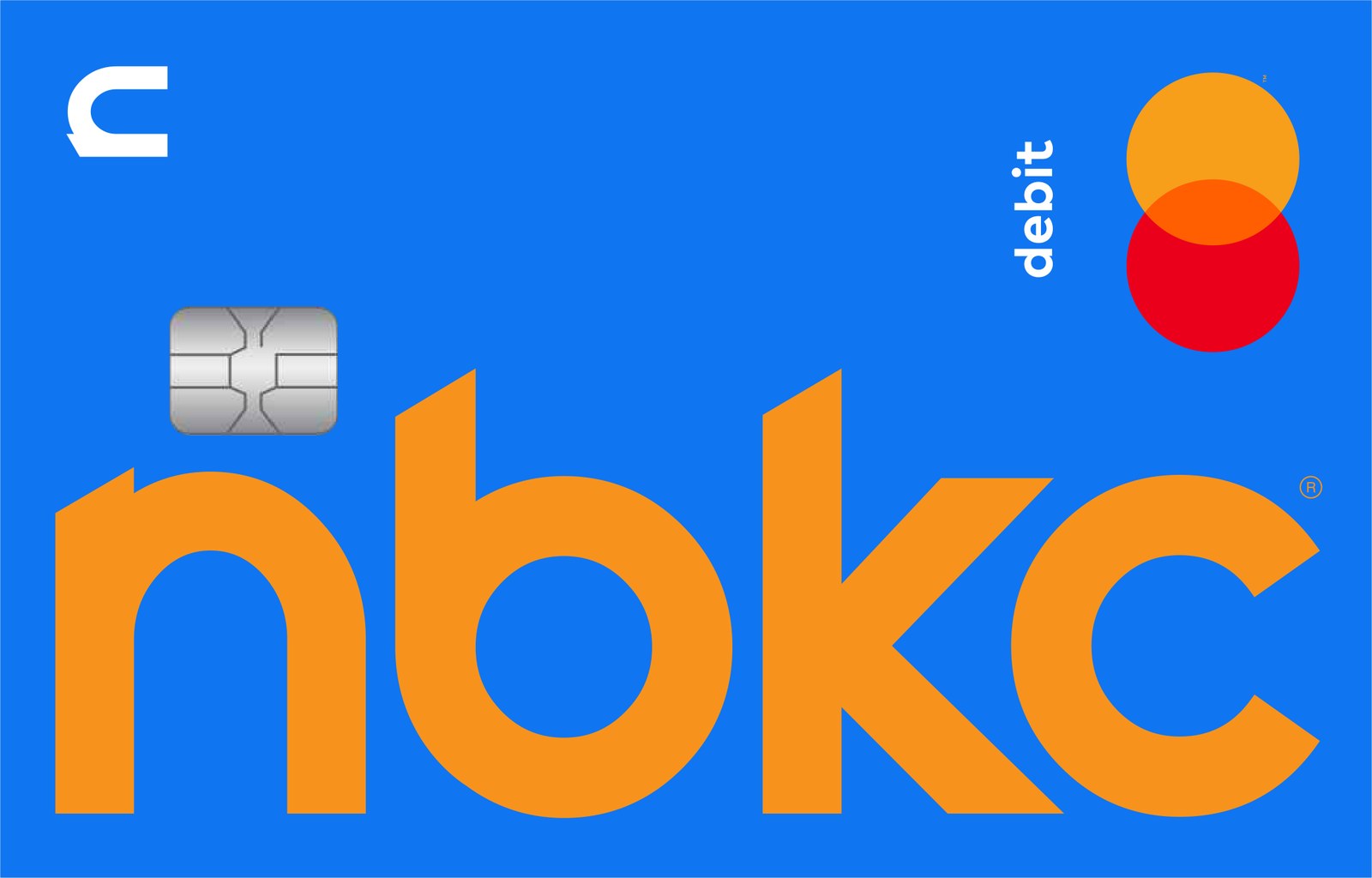

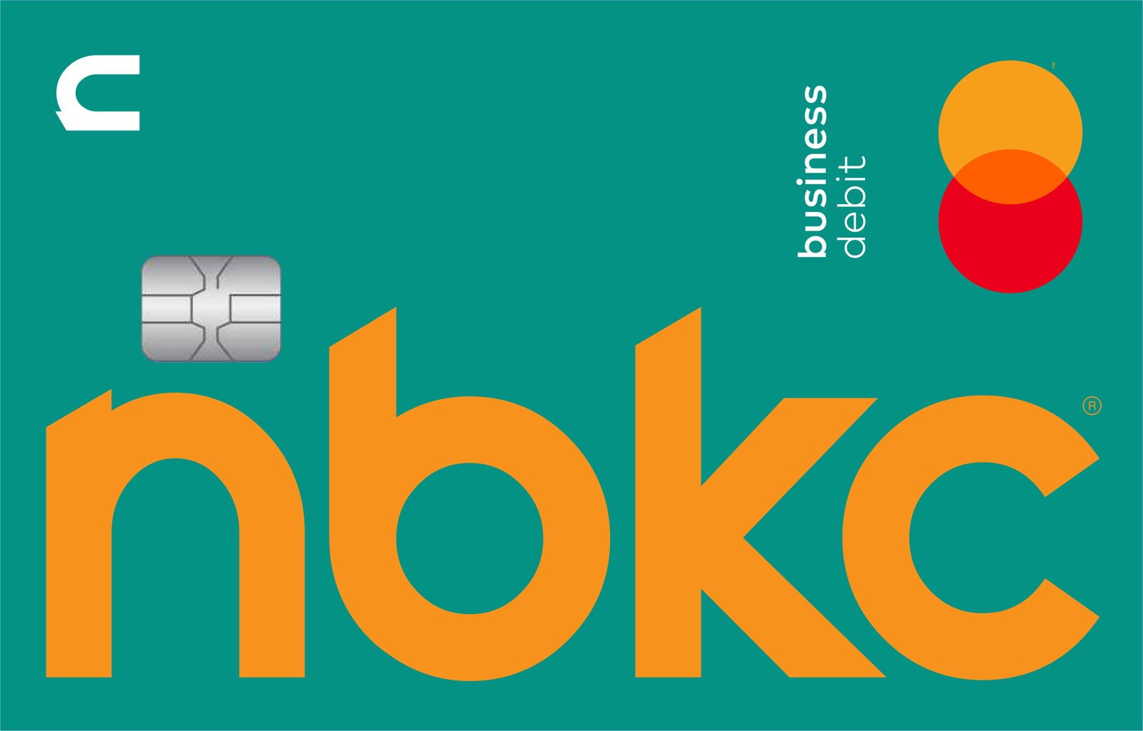
Before any scene was lit, both cards turned on black so the agency could check them against the proofs: how strongly the gloss reads, the chip's metal, the card's thickness and edge. The first proof sat on a mustard ground; the second moved to black so nothing competed with the card.
What the agency received.
| Set | Count | Size | Length |
|---|---|---|---|
| Scene animations | 12 | 1440×1080, 30 fps | 3–8 s |
| Seamless loops | 12 | 1440×1080, 30 fps | 6–17 s |
| Stills, one per scene and card | 12 | 1440×1080 | / |
| Print stills | 14 | 6000×4500, PNG, most with transparency | / |
Animations, loops and stills were delivered together on April 30, 2024. The print stills followed on August 16.
Made with Native Digital.
Card numbers and names shown are the printer's specimen data.